Now that I've decided to bring these shops together I am going to start by designing a logo for the company, I am going to keep the name Robinson's as it is the traditional name that everyone knows and it will be nice to design something with a traditonal old style theme yet modern at the same time!
Research on shoe makers logos:


Shoe shop logos:


Shoe shop signs:


Shoe bags:


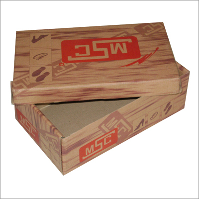
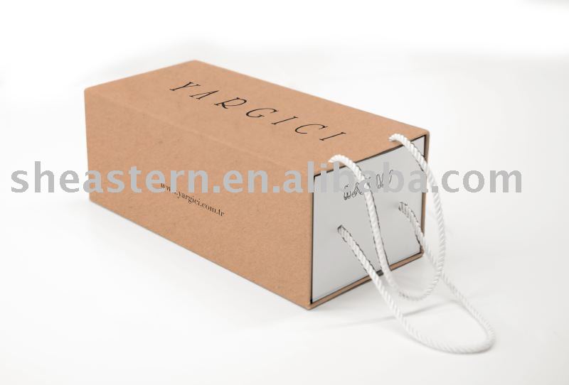
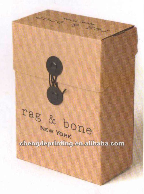
Shoe boxes:




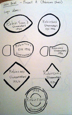
Ok so I started sketching out some logo designs firstly, because the company is really old I liked the idea of an old wax stamp or an old inky stamp idea for the logo, I tried some with shoes also.
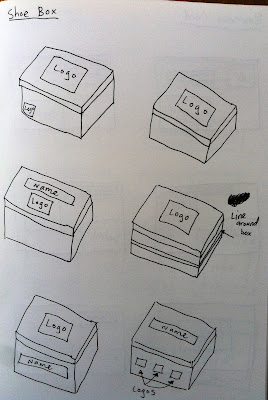
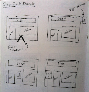
Here is all my development sketch work for my carrier bag, shoe box, business card and two shop signs:
Here are the logos I developed from my sketch ideas:
I asked a few people which logos they preferred and I worked with the two that came out on top. Here is the development work for the companies livery:
Business Cards
Carrier Bags:
Shoe Boxes:
Shop Signs:
Example of how the signs could be used on the shop front:
Ok so here is just an overall reminder of my design solutions, I went with the round logo as I liked the old style it had, it represents the shoe lace rings on the old brogues or it can be used to represnt the drainage holes that were on all 'Irish Brogues'. I decided to go with the old fashioned brown paper bag theme for the carrier bag and the same for the shoe box and business card. I had used the same colour for the signs but they looked a bit dull for the shop so I changed this to white with just a hint of the brown colour around the edges:
Here is my design development page:








No comments:
Post a Comment