Monday, October 29, 2012
Sweet Treats Livery
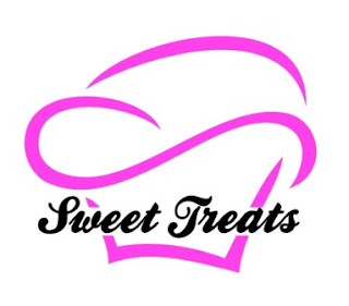
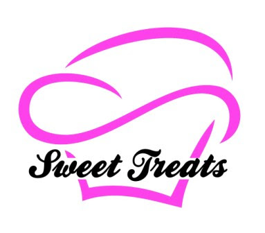
So here is my final logo for Sweet Treats bakery, their business card, an example of a cake box and a set of oven gloves:
Logo Development
So here is my logo before adding the bakery name and colour. It symbolises a cupcake but some may also say it looks like a chef's hat, either works for the bakery but my intentions were to have it look like a cupcake.
Then I started experimenting with it, firstly I found a font that I thought looked well and gave it that sweet look. I decided on 'Ballpark'. Then I tried a few ideas with the logo first and then added the bakery name after it on a straight line. I tried different colours to see which suited it best. You will see that I stuck with similiar colours in each, such as pink, purple, black and red. This came from researching a range of bakery logos, they all seemed to follow the same palette of colours.
I then tried adding an outline to the logo, filled with colour and without being filled at all.
I then put the cupcake large on top with the name along the bottom.
Then I tried putting the name right along the middle of the cupcake, seperating the lines on the bottom half.
Then I tried putting the name inside the cupcake and bending it with the lines of the logo.
Finally I incorporated the name into the lines of the logo, where the name helps to make up the drawing.
Implementation of the logo
After showing my client the range of ideas for the logo, she decided on this one below. She felt that the name could be seen more clearly on this logo than any of the rest and she also went with the bright pink for the cupcake colour. Everyone loves pink cupcakes!


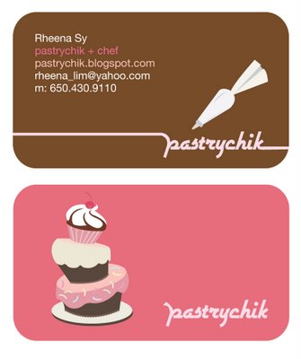

 Catherine's Cupcake Bar - Design by Socialite Designs - www.socialitedesigns.com

Coco & Company Cupcakes - Design by Socialite Designs - www.socialitedesigns.com

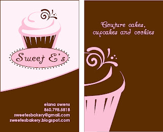


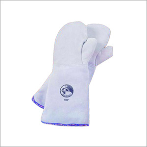

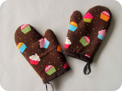
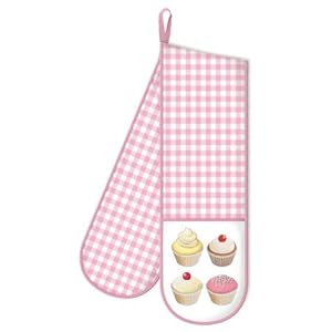

I then had to show how the logo would look on the company's livery. Stationery wouldn't really be needed for a bakery so I decided to design a business card, a cake box and also a set of oven mitts that could be used by the workers in the bakery. I done some research on these items and here are some ideas I liked:


 Catherine's Cupcake Bar - Design by Socialite Designs - www.socialitedesigns.com
Coco & Company Cupcakes - Design by Socialite Designs - www.socialitedesigns.com


I liked the business cards that had just one main image on the front and then the details of the business on the back. I looked at some cake boxes then.


Alot of the cake boxes I looked at were pretty plain but the majority of them had the logo big on the lid, the main thing the buyer will see when opening the box.
Then I went looking at printed oven gloves.


Ok so the oven gloves were upto me to design!
Here are some sketches I done to help me get an idea of what layout I was going to use for the branded items:
Here are some sketches I done to help me get an idea of what layout I was going to use for the branded items:
Subscribe to:
Comments (Atom)
